Someone didn't send me their email. they must not use it anymore. ;) I figure here would be safe enough anyway. So, before you go tearing my work apart I have some questions/comment that I am concerned about and would like addressed.
--The templates they gave me are kinda different? I can't make it work all three of them. should I make it longer to make it fit the guy wearing the shirt? (also I didn't edit it so it looks like he's wearing it. I assume it will bend around him a little.) I don't even know if I could make it fit the pic of the real (er looking) shirt.
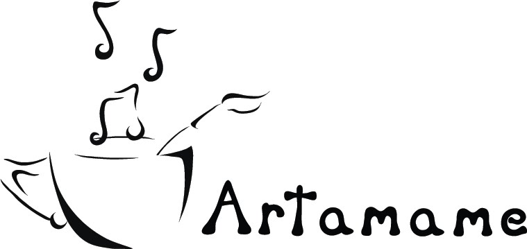
--The collar/shoulders. Should I make it match the shirt more? the back of it (seen in image two without the swirls.) should I make the back neckline farther up and/or matching the collar of the shirt too? it currently has the same collar as the front.
--detail. should there be more of it? (which also means less printed. I'm a little nervous about how much would be printing now.) less of it? I have no idea if I can use more then one color, because the information they had was also unclear. My brother suggested I send it to threadless, so if you can find out... if it even needs more colors.
--Also about the colors I don't know what colors. I was thinking of having it a like clear shiny coated color, but that doesn't need to be the case. oh and shirt color, both colors if you have any opinions on what it should or shouldn't be.
--obviously anything glaringly obvious that I missed, because I stare at a screen all day.
I feel like there was more I wanted to ask about. Or is it just plain hideous or no one would like it and I should try something else. or give up.
Okay, go. *throws up a shield to protect herself from people who may have gone to realer art schools* Also, I can't put fake html where real html can go.